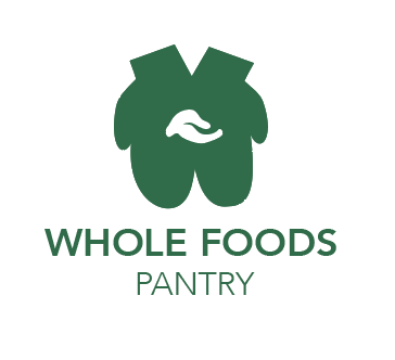
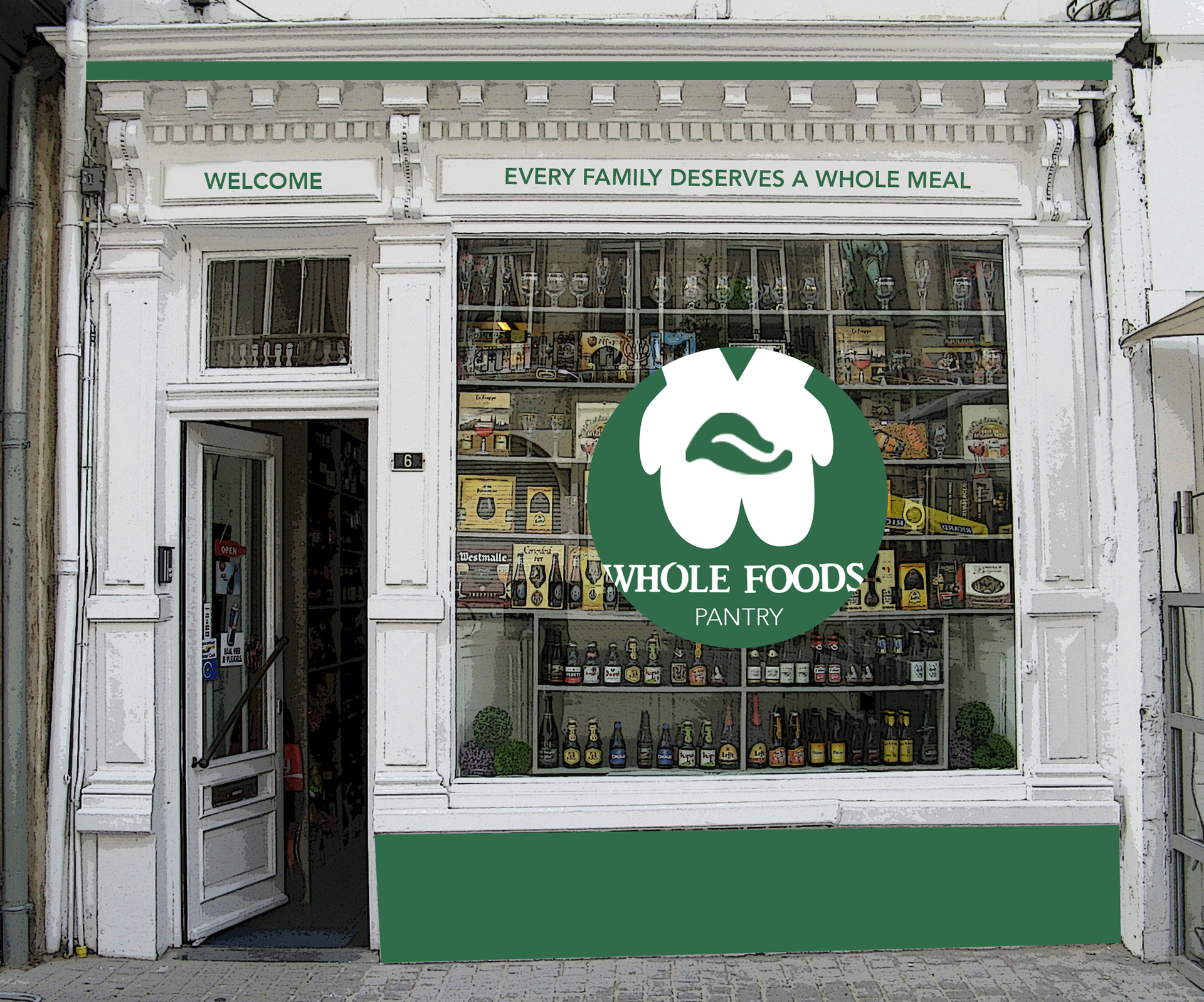
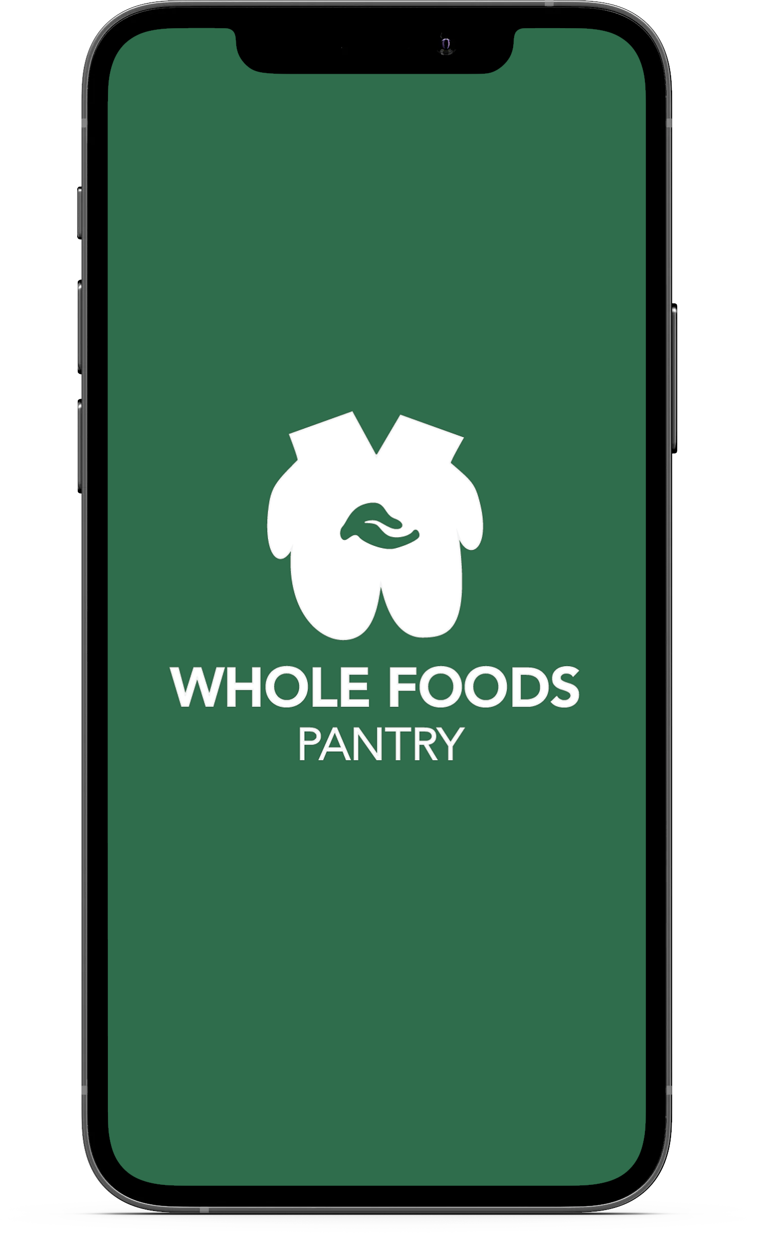
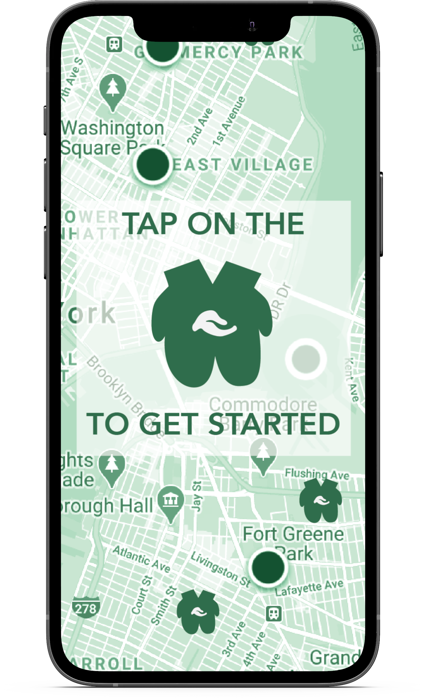
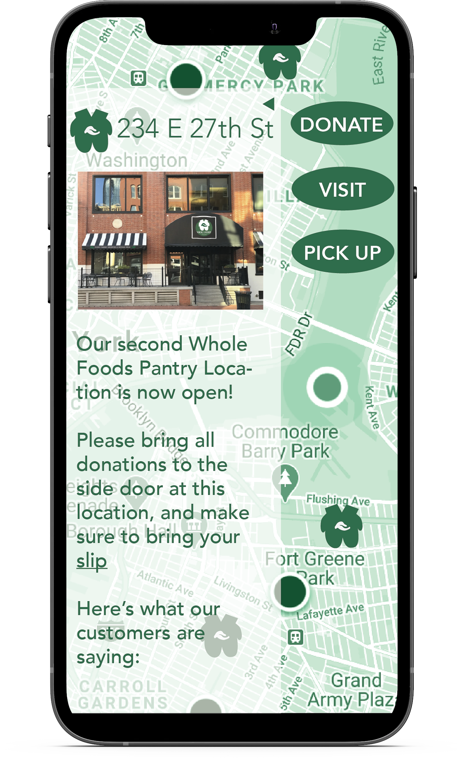
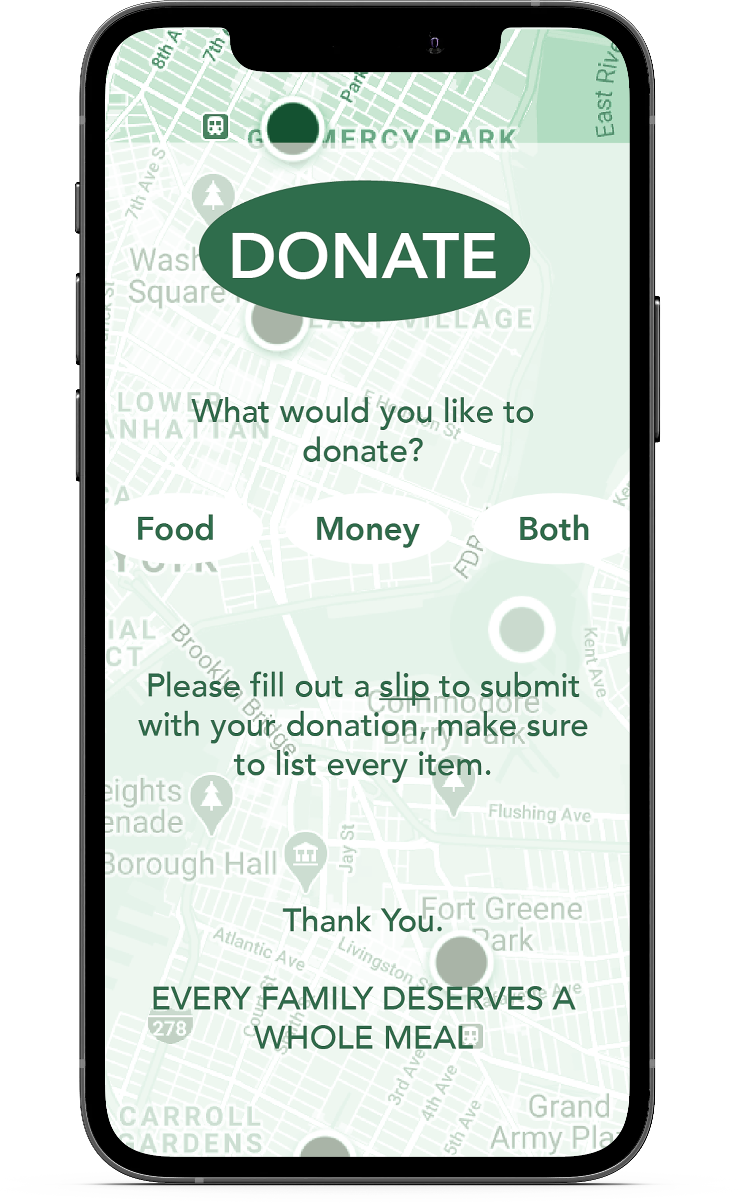
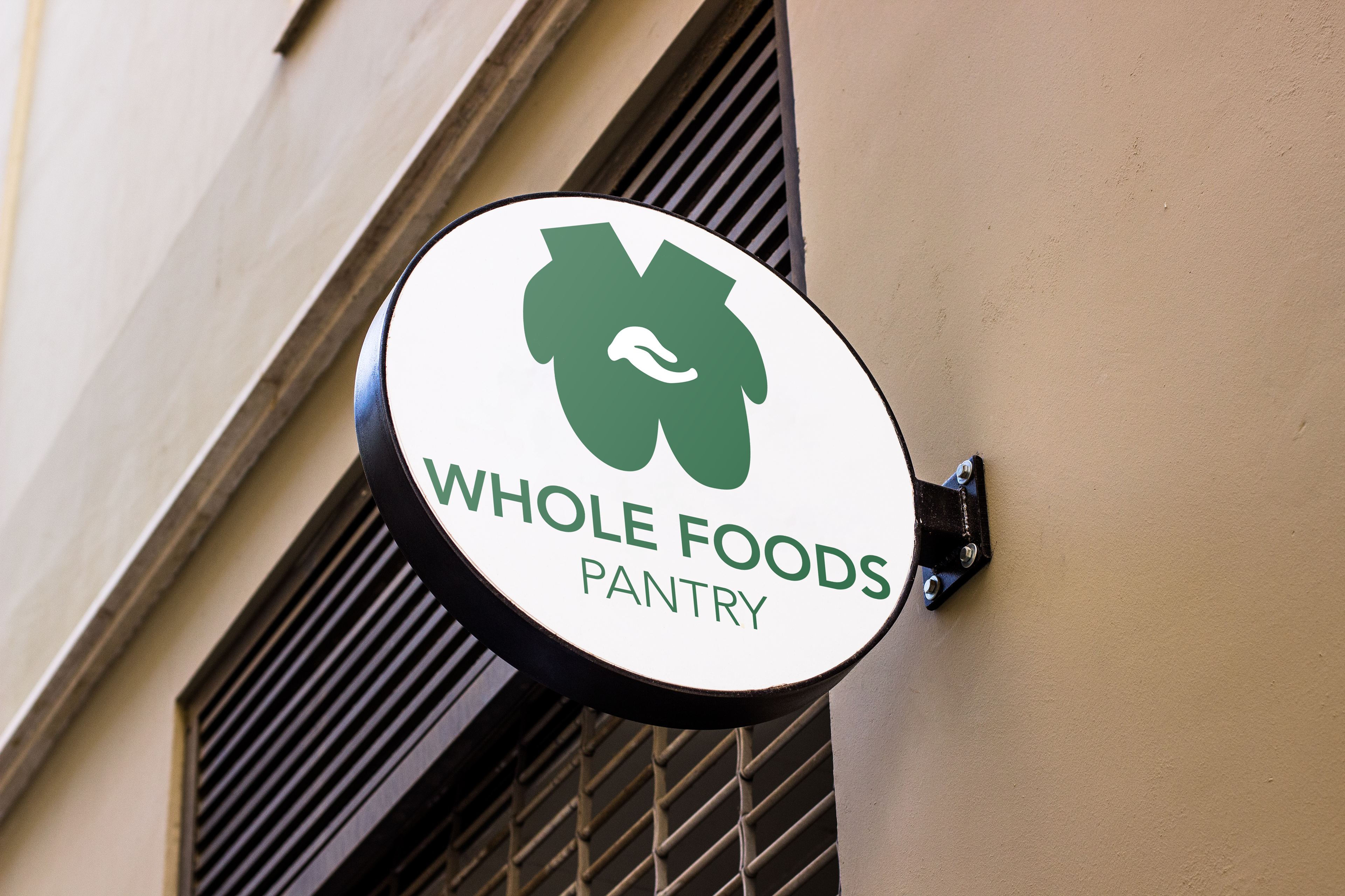
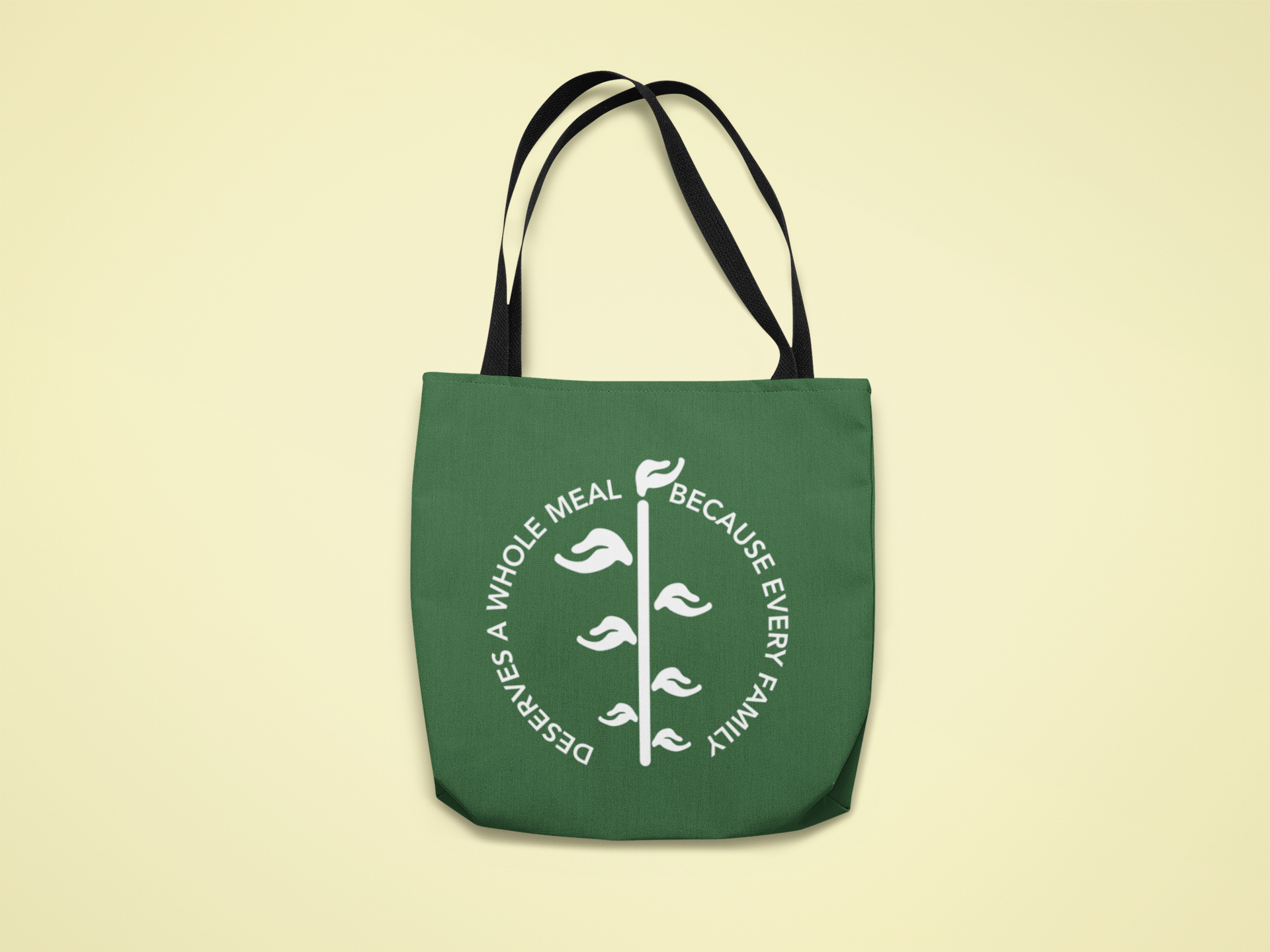
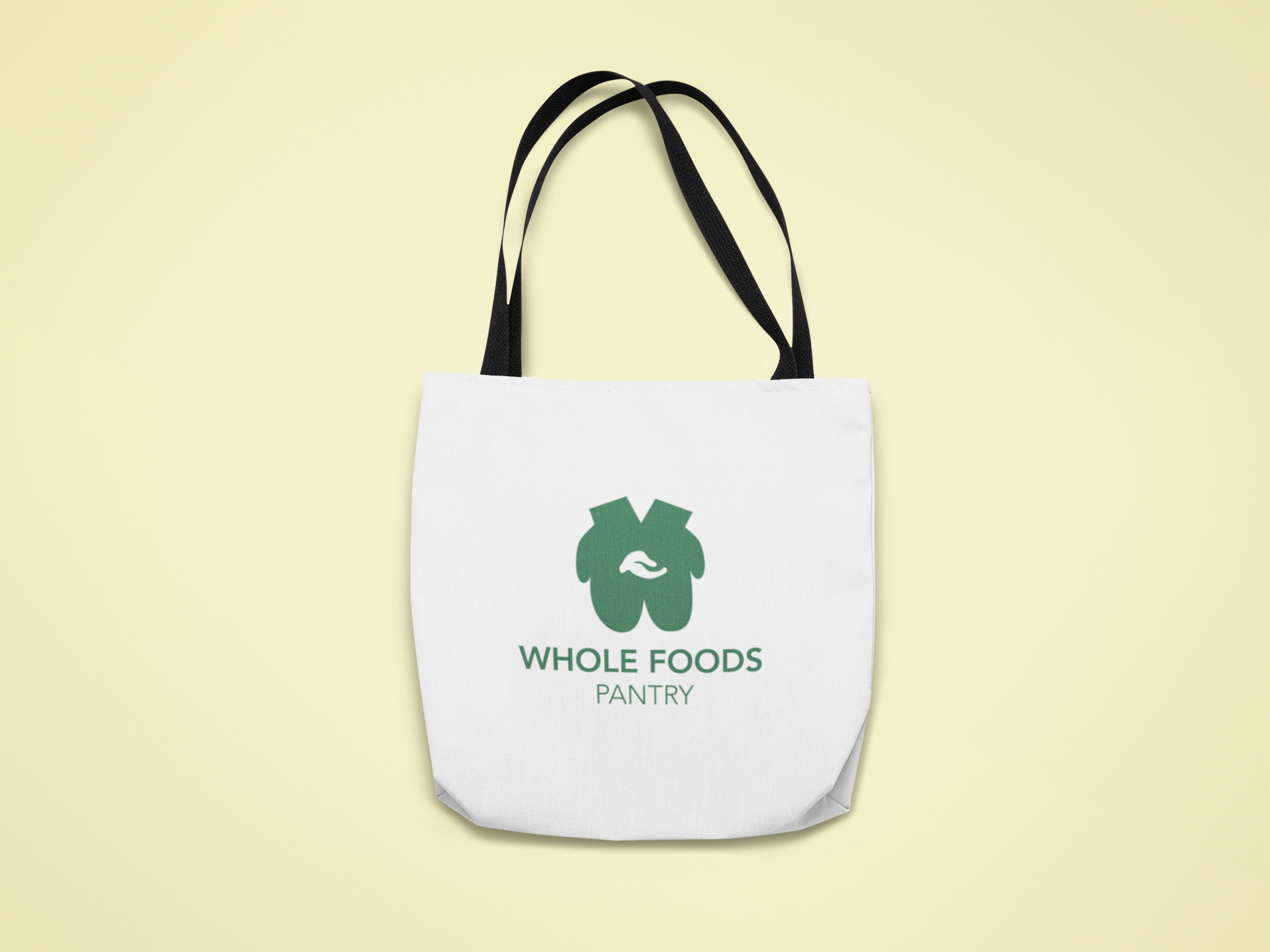
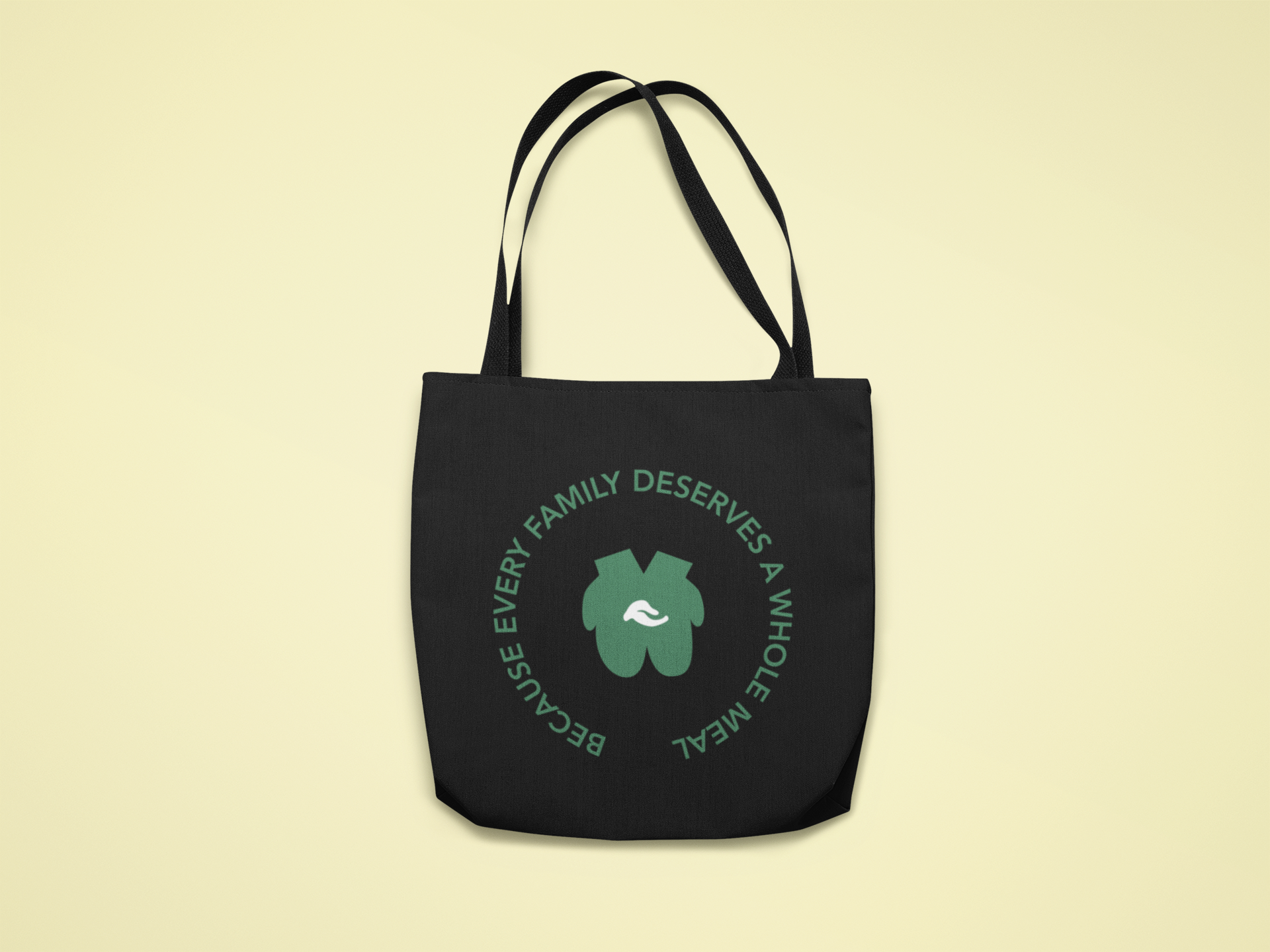
My first exploration of the world of rebranding produced this group of assets for my idea: Whole Foods Pantry. Many brands are linking themselves with well known social causes, so if Whole Foods were to be marketed towards those experiencing food insecurity, it would be a very different looking brand. I came up with a new logo, slogan, and advertising strategy in order for Whole Foods to change their image. Kept a similar font style so the logo is still recognizable, while using the leaf from the original logo to represent food, and pairing it with the mitten hands as a symbol of offering food to the community. This style was also applied to the app and bag designs, which stemmed from alternate logo design ideas.
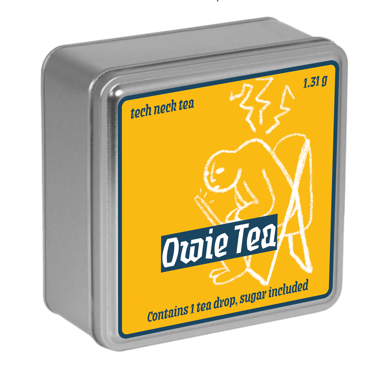
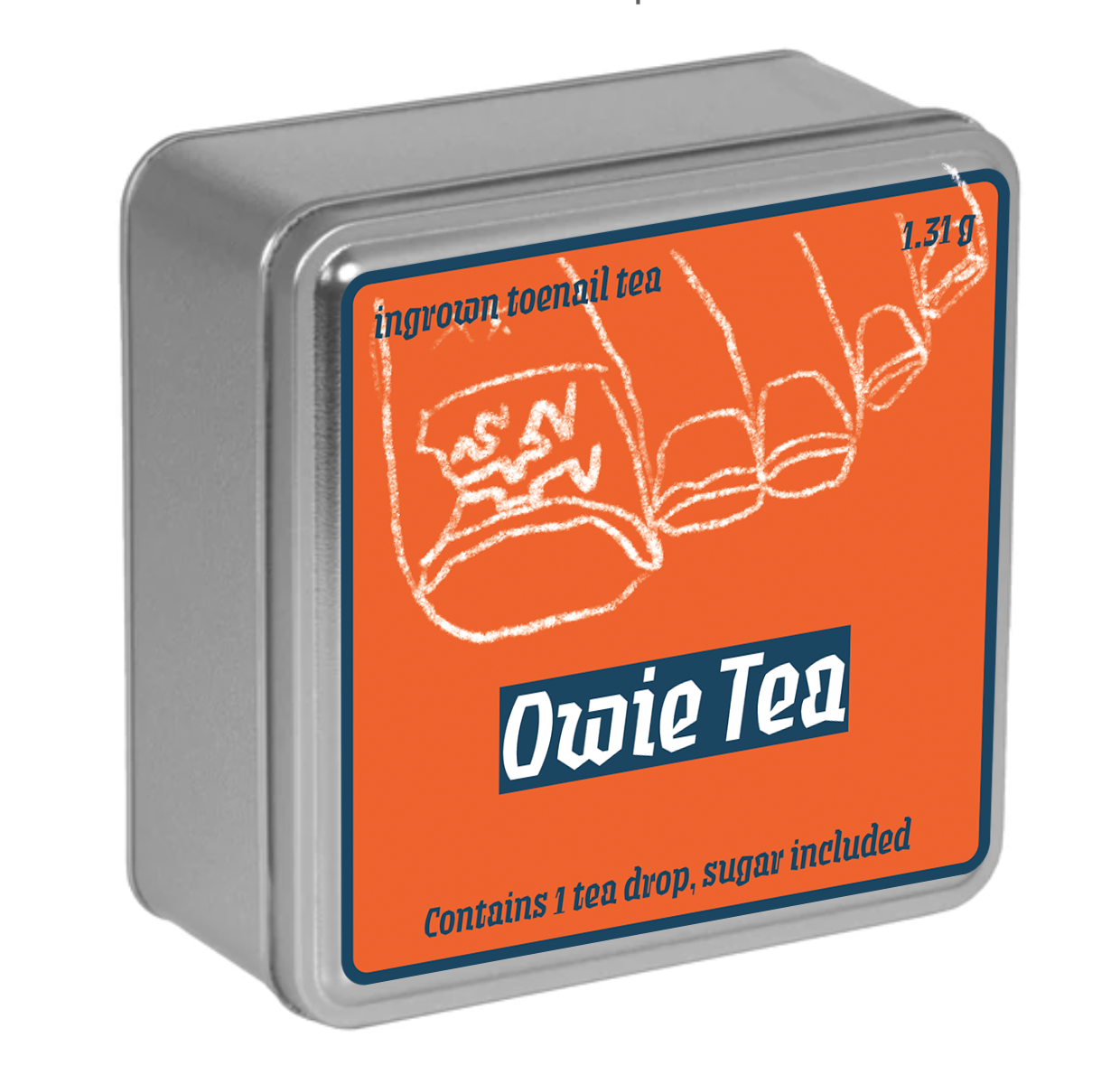
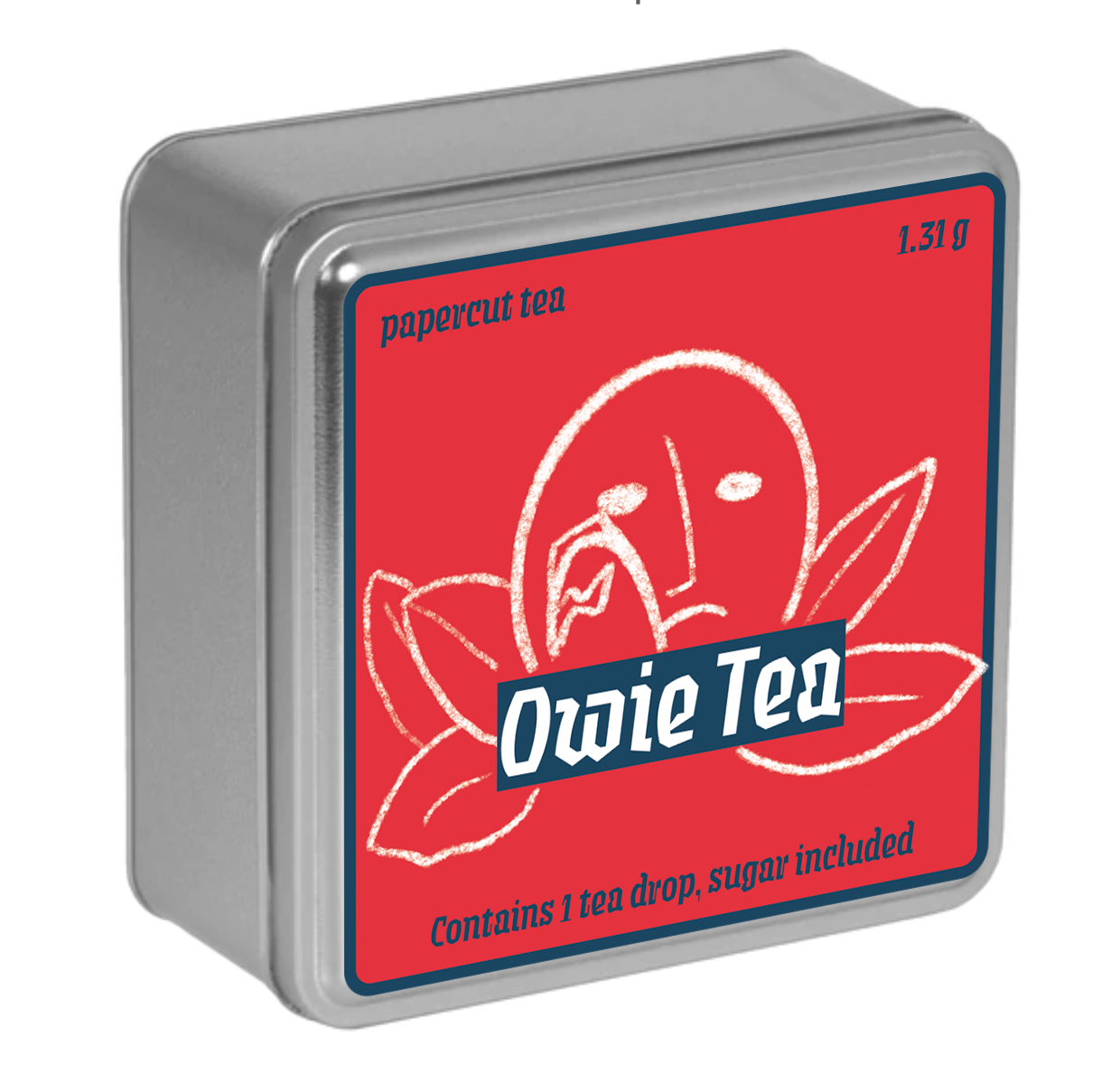
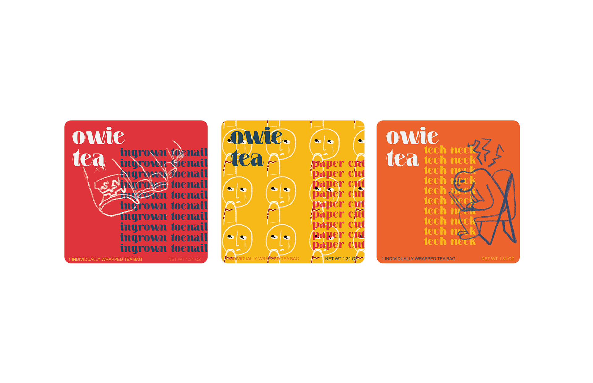
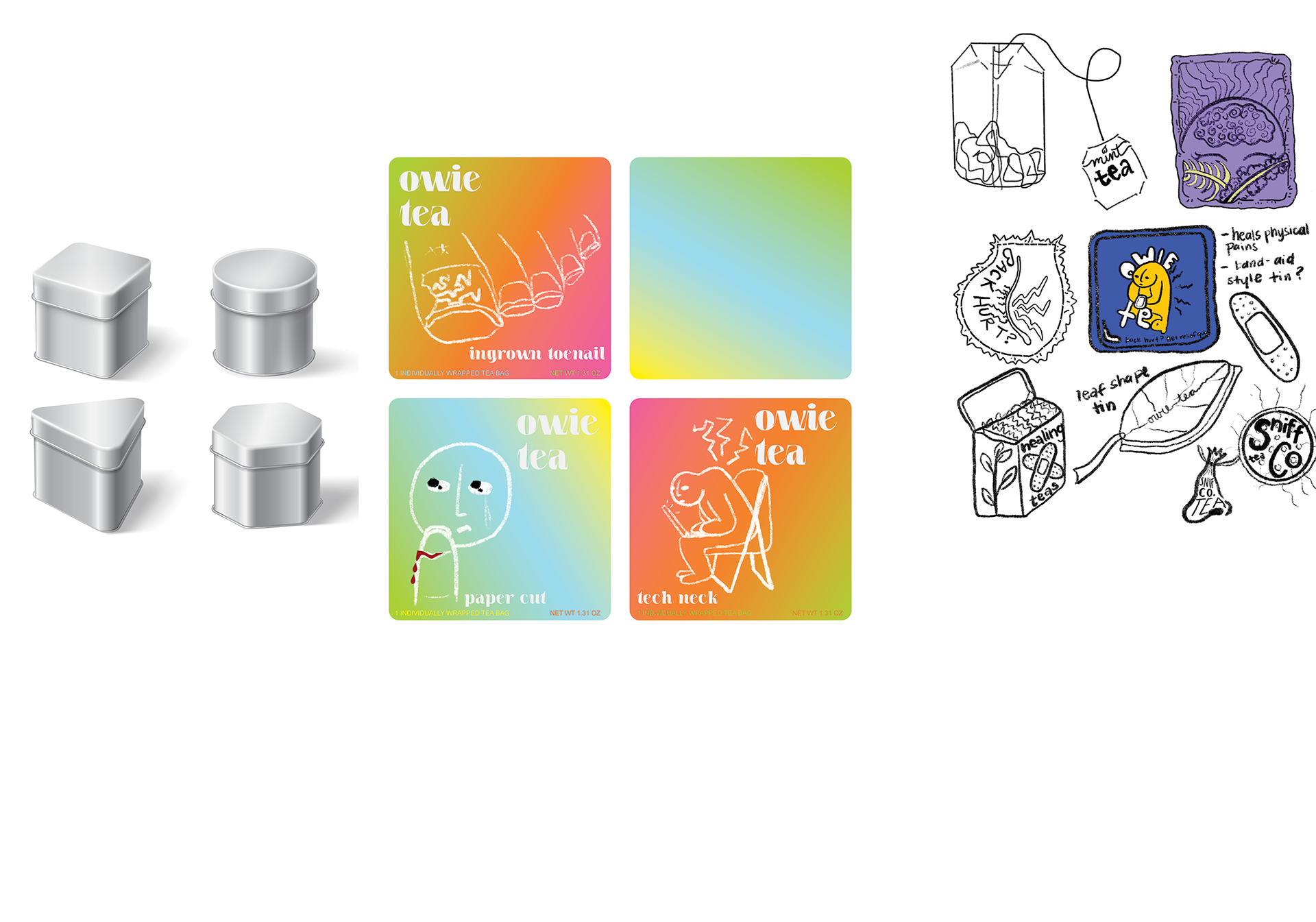
OWIE TEA PACKAGING
This unique packaging is for a made up product - Owie Tea. These tea drops contain tea and sugar in one compact drop that will cure your minor ailments such as an ingrown toenail, tech neck or a paper cut. I decided to use the hunched over man from my initial sketches to inspire the designs for the rest of the packages. I experimented with different type treatments and settled on a typeface that echoed the qualities in the illustrations - jagged lines to show pain.
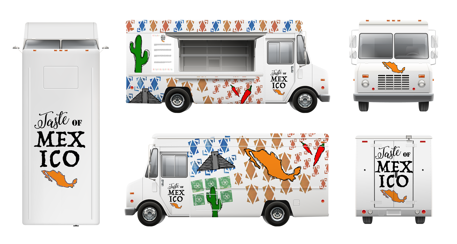
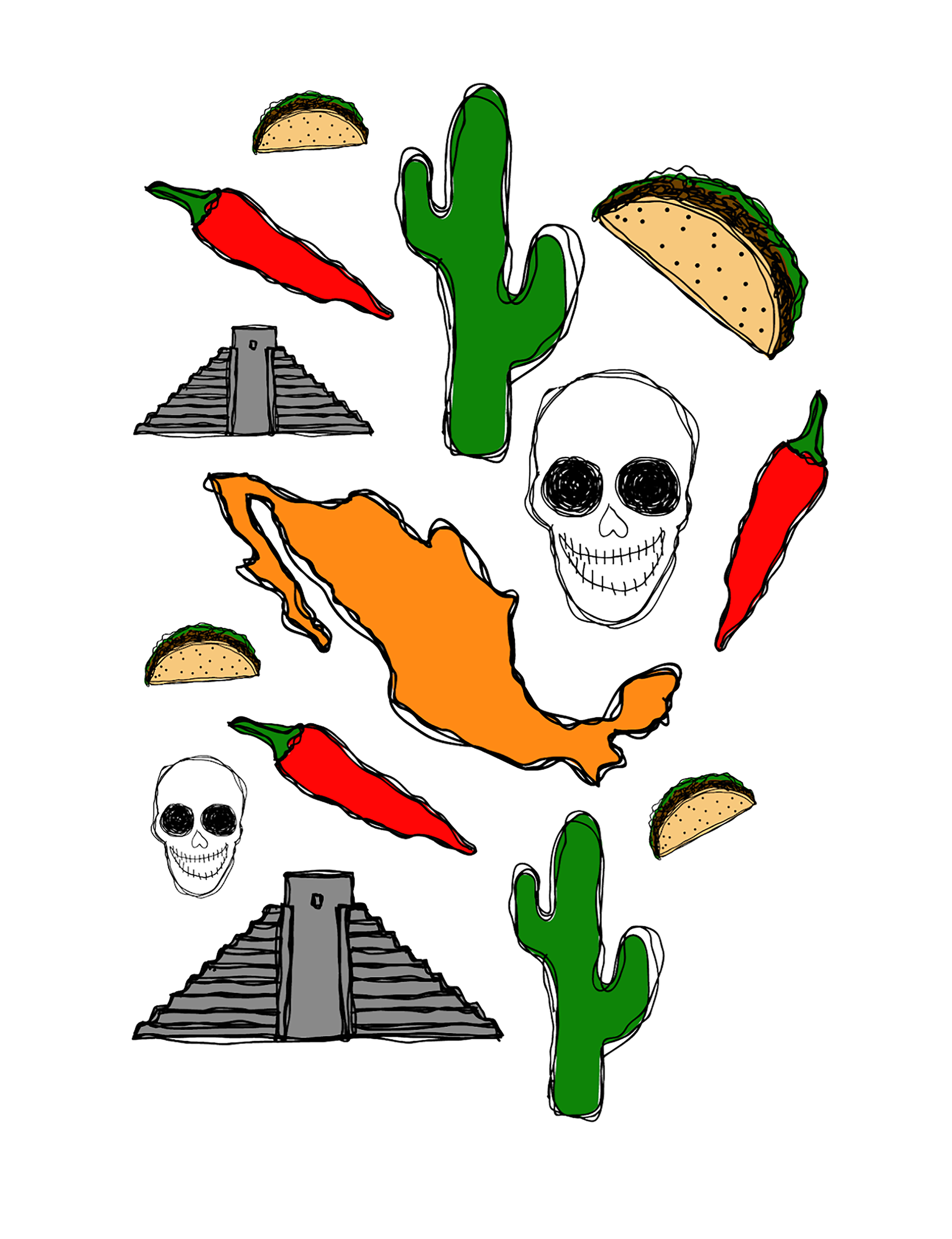
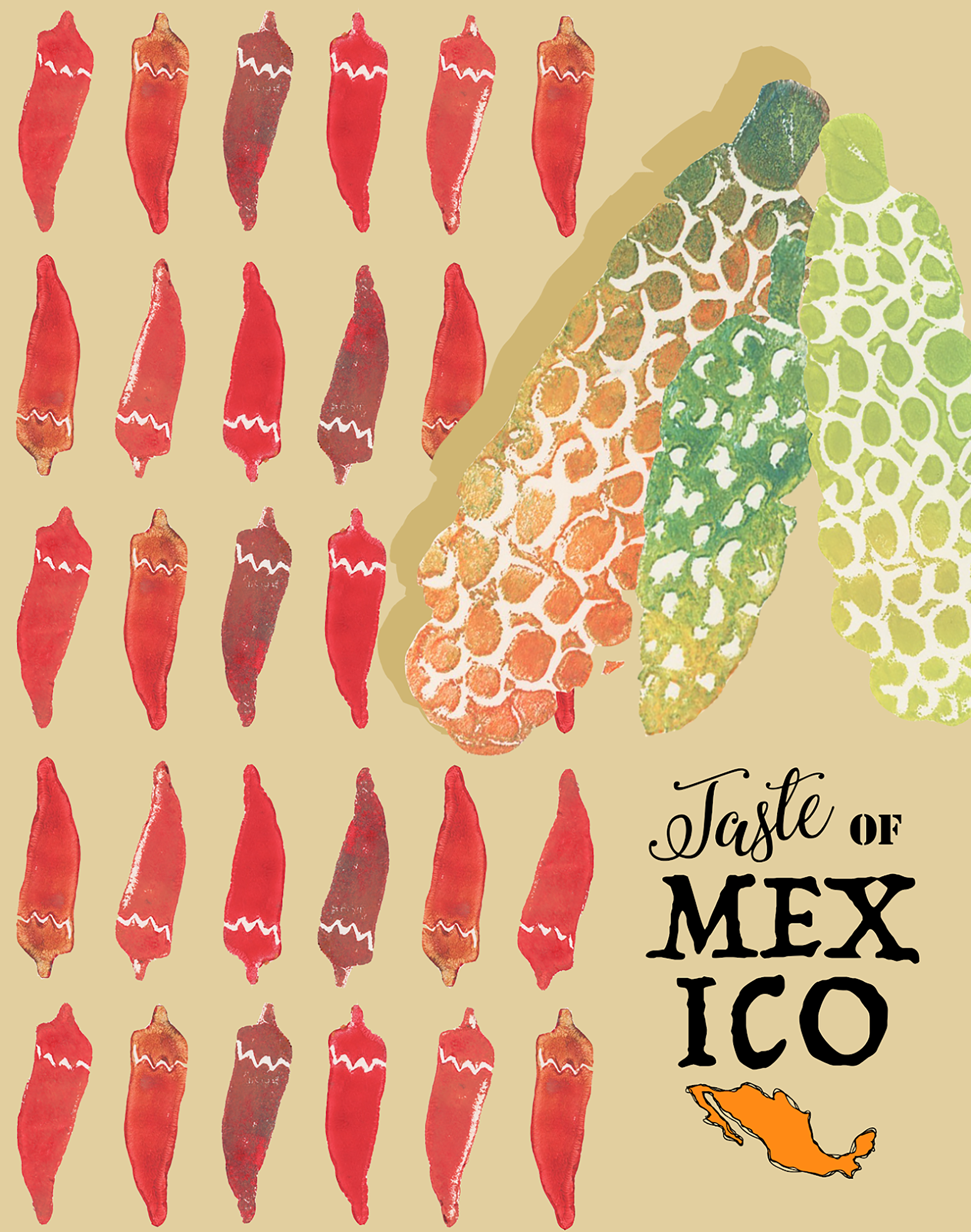
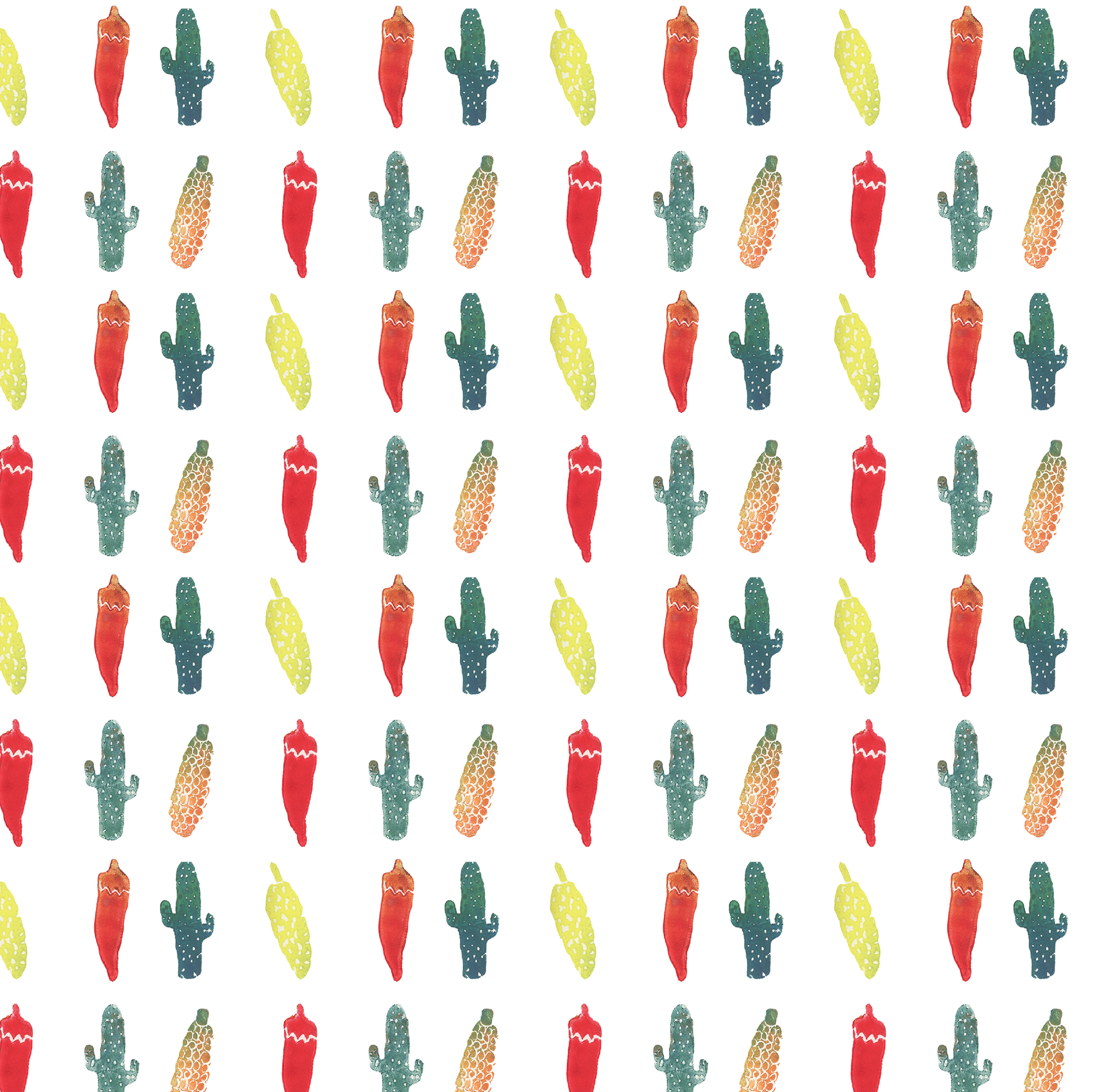
TASTE OF MEXICO
Mexican restaurant branding including food truck exterior, menu cover, patterns for burrito wrapping and napkins.
To create the branding for this Mexican restaurant and food truck, I created symbols in illustrator and using printmaking, and combined them to make patterns - some inspired by interior design seen in a book on Mexico, some just created using imagery specific to Mexican culture.