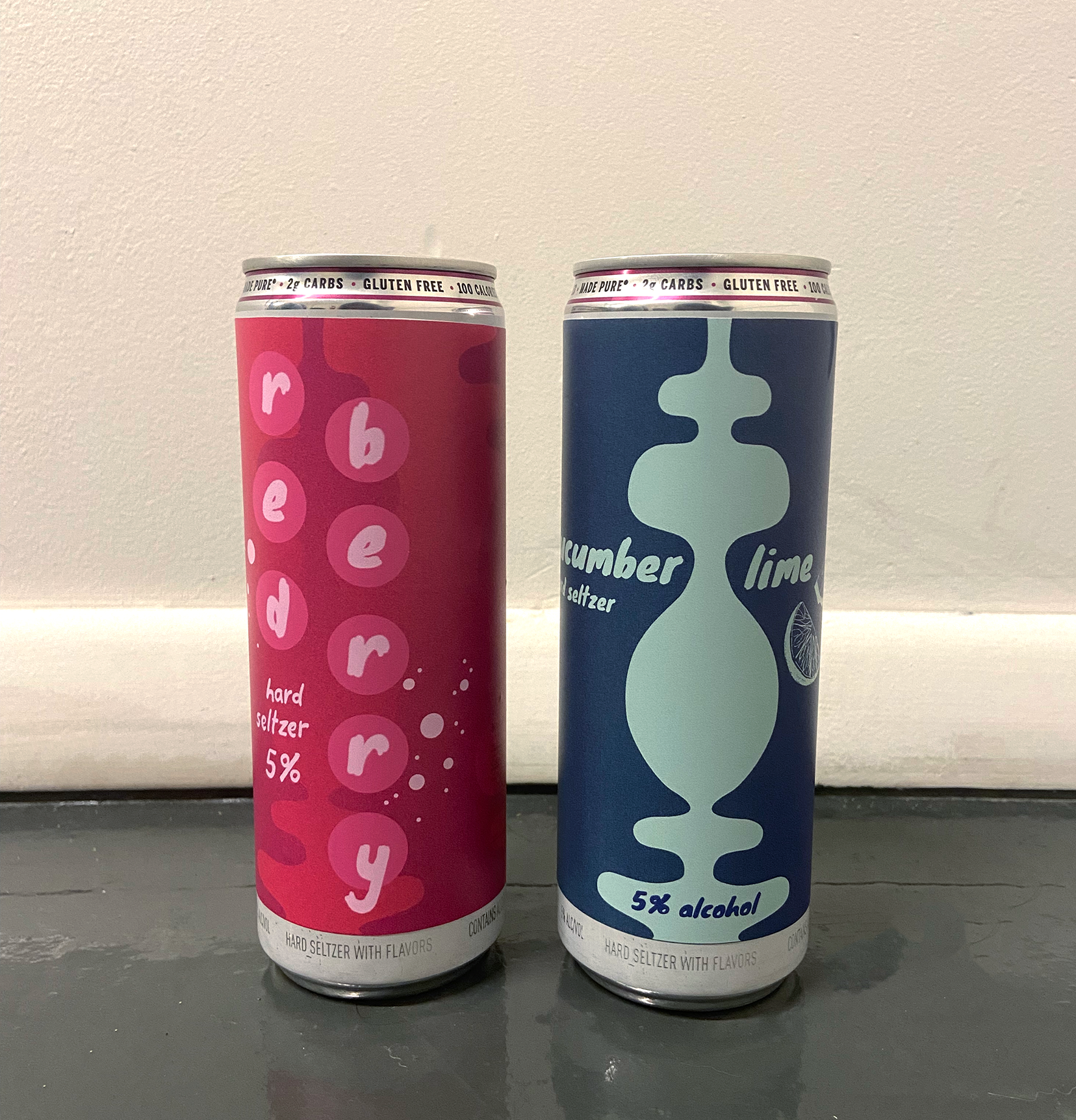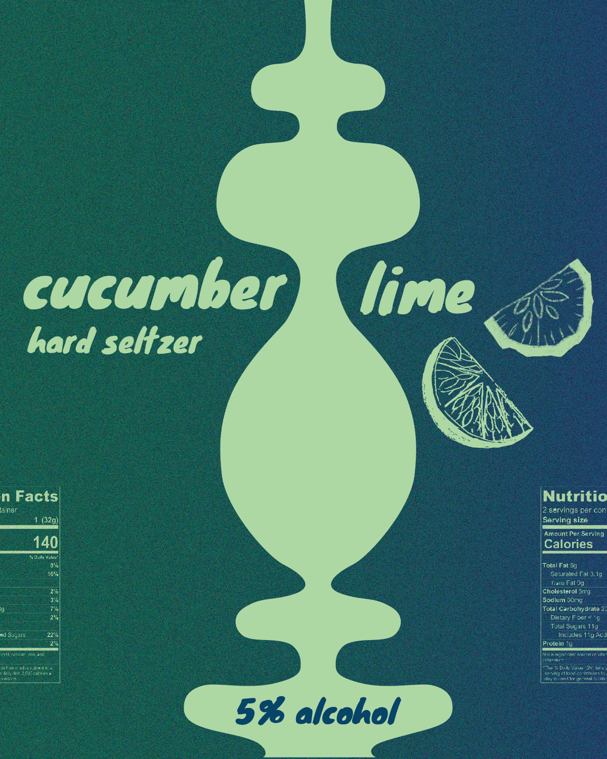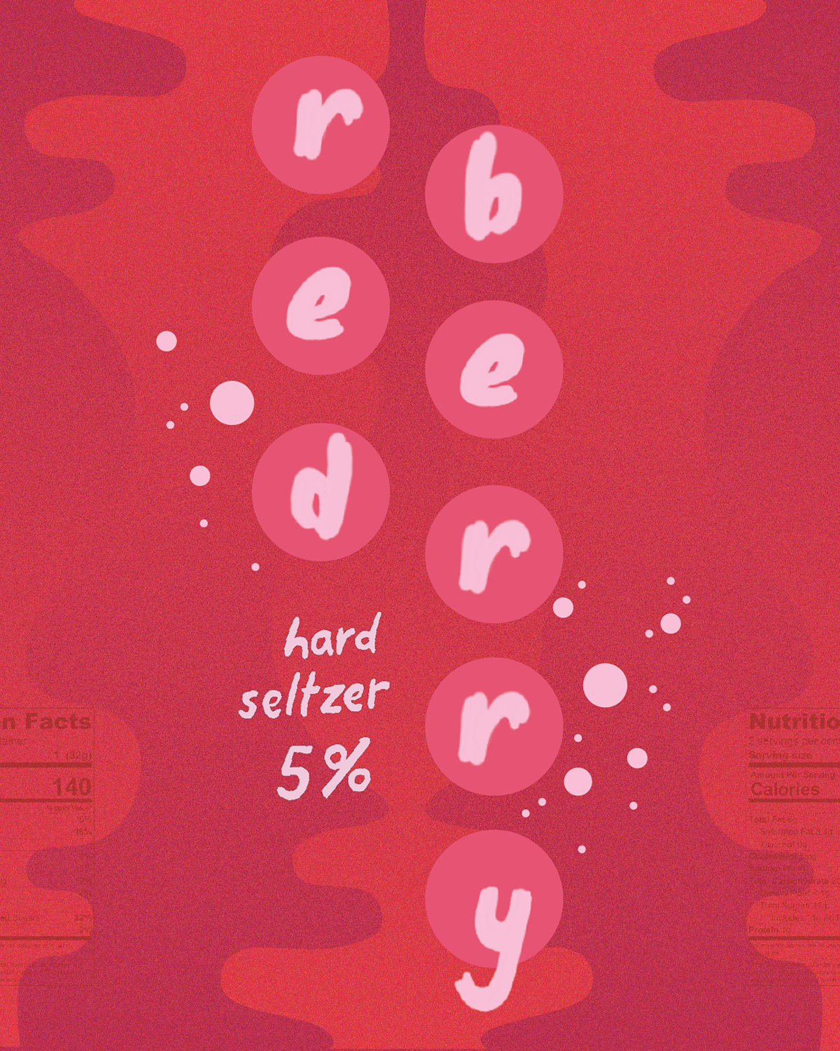
These can designs were inspired by the colorful & intriguing can designs in the grocery store and the curved shapes that give the packaging a liquid-like feel were inspired by a friend's pottery work. I chose a font that had the same sensibility and paired it with hand illustrations and layered texture to give it some contrast.