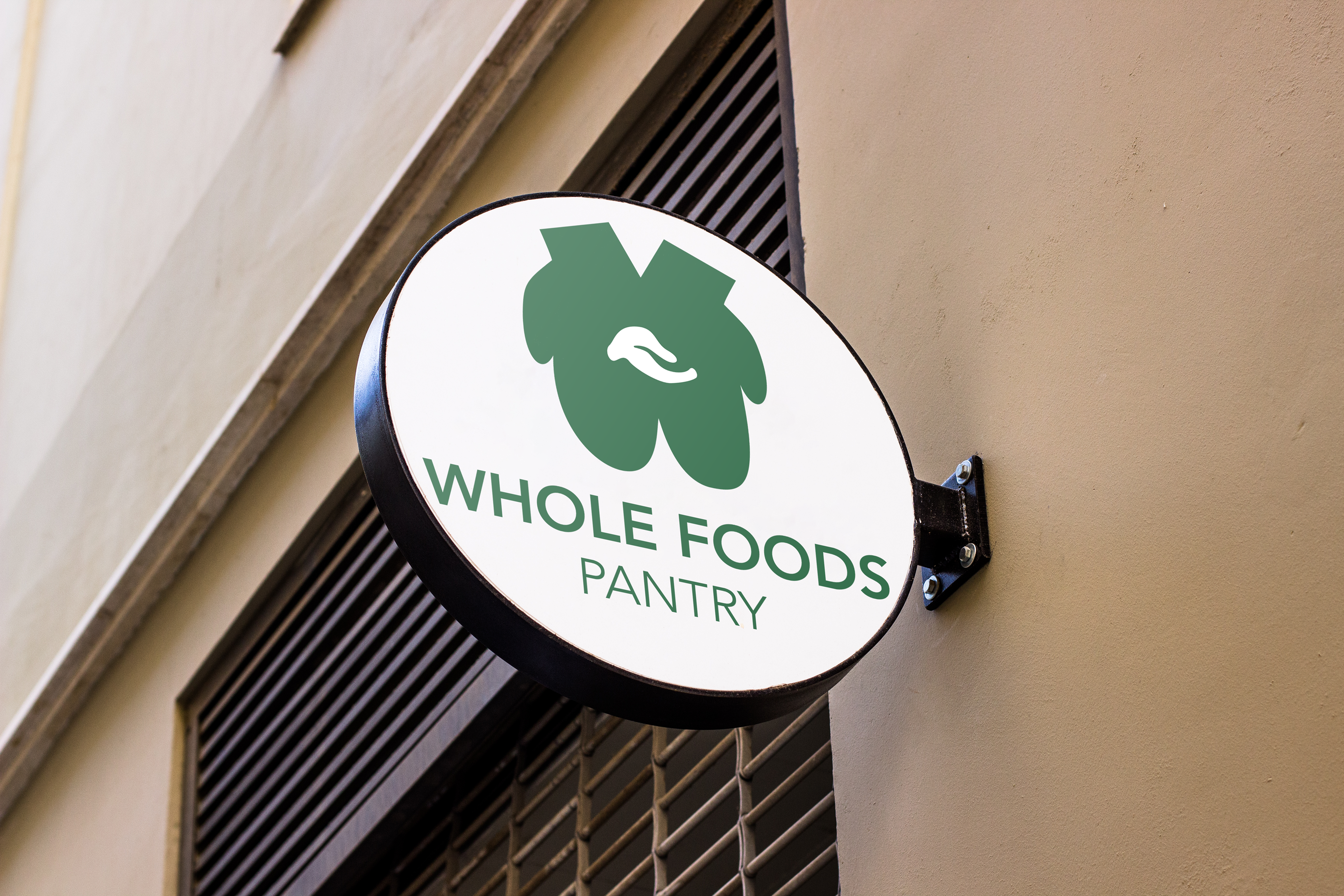
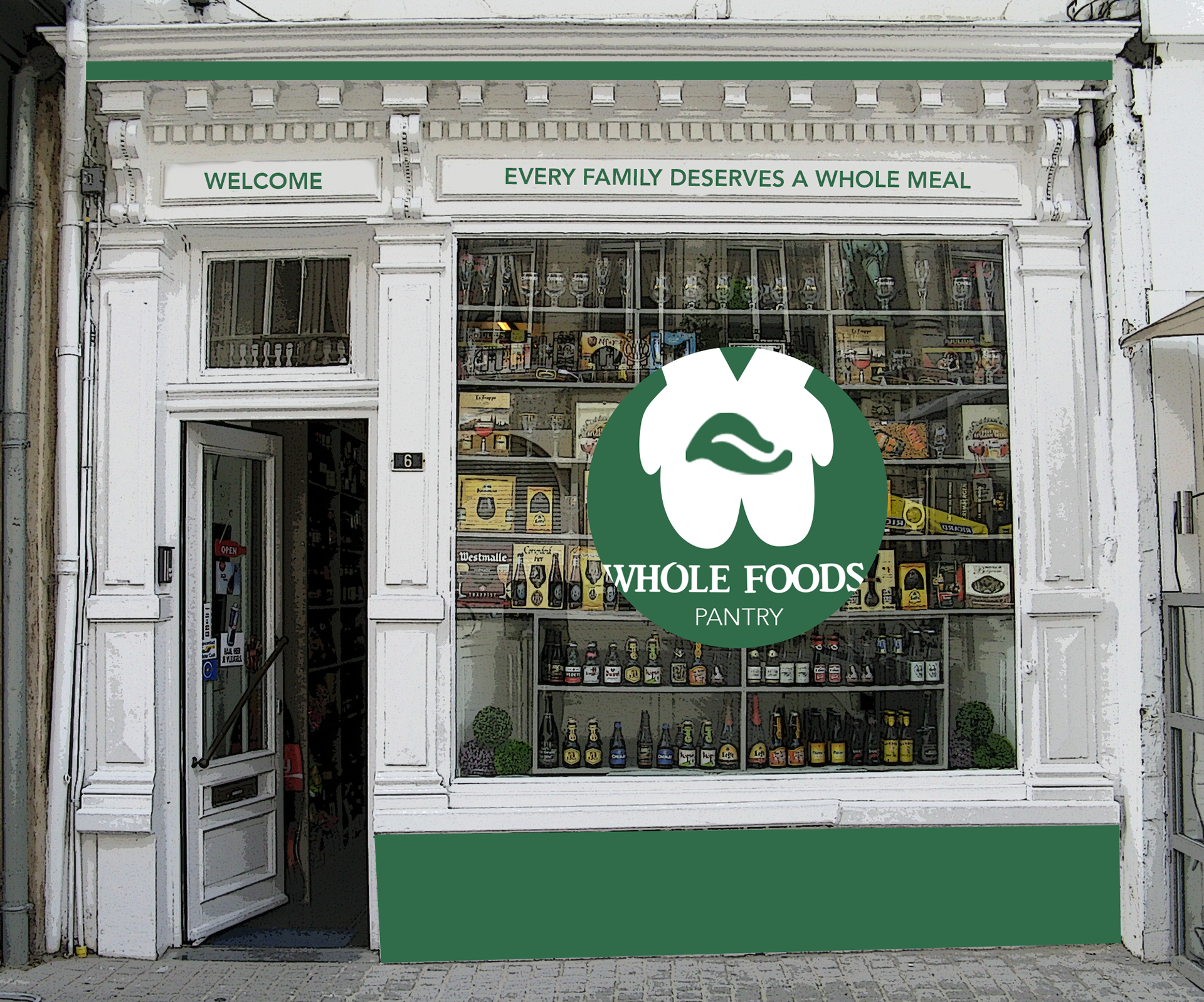
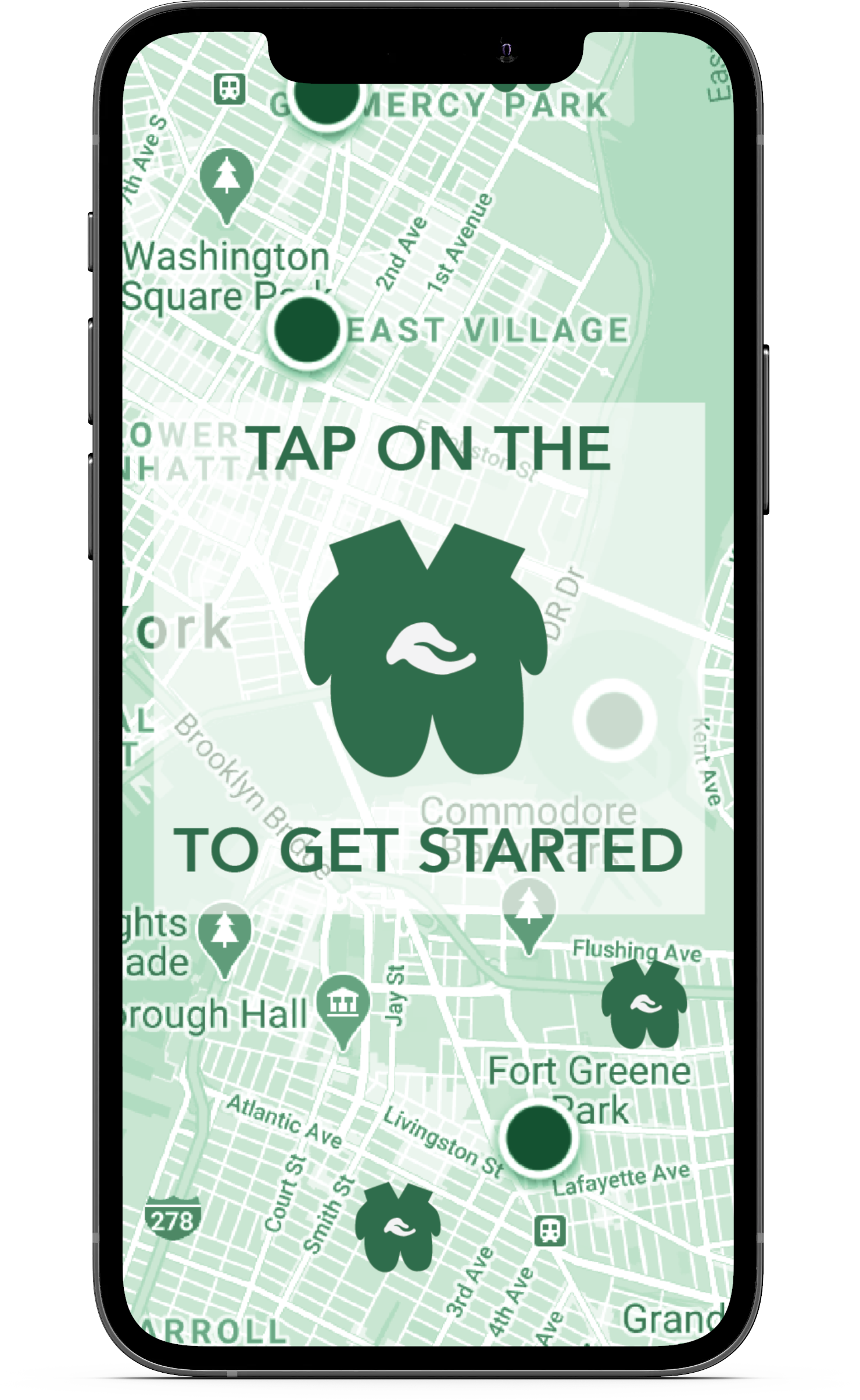
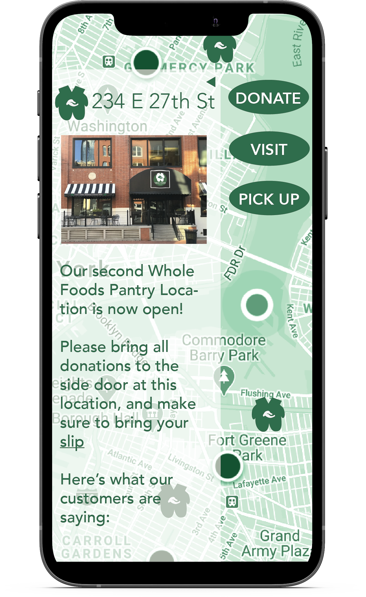
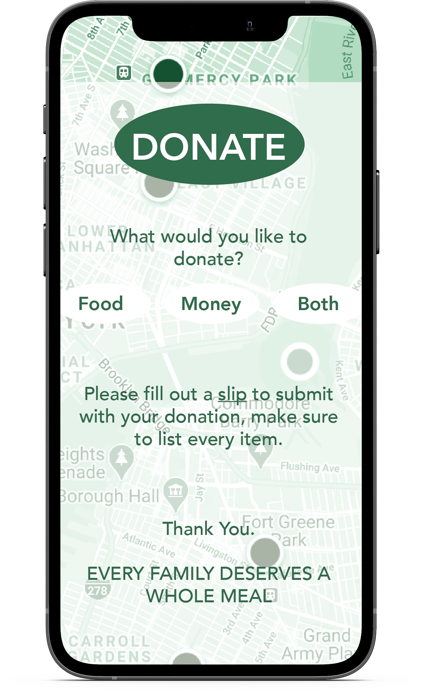
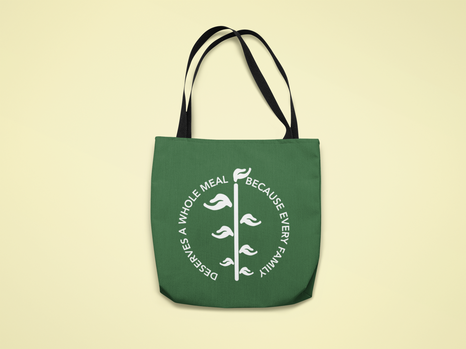
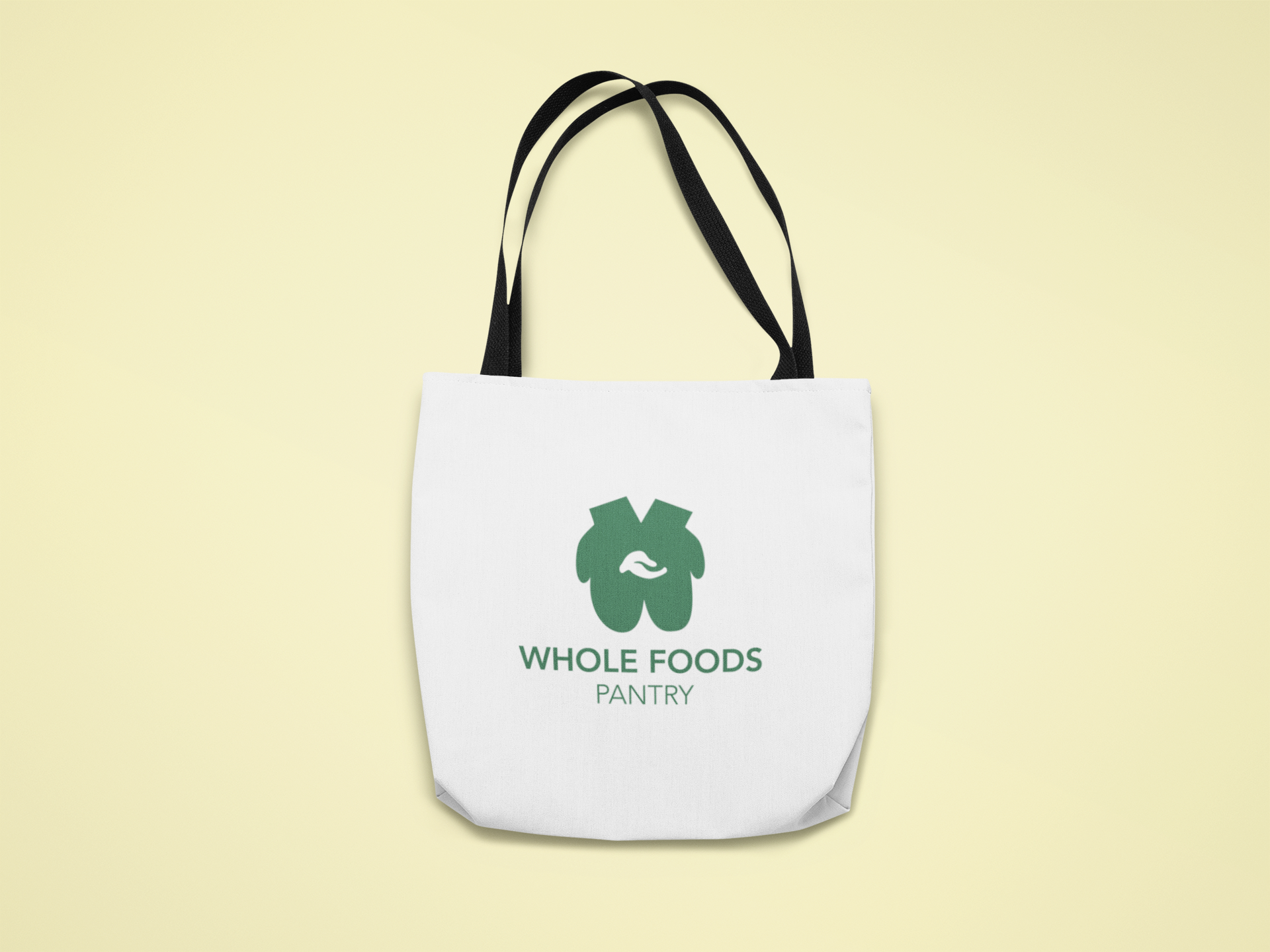
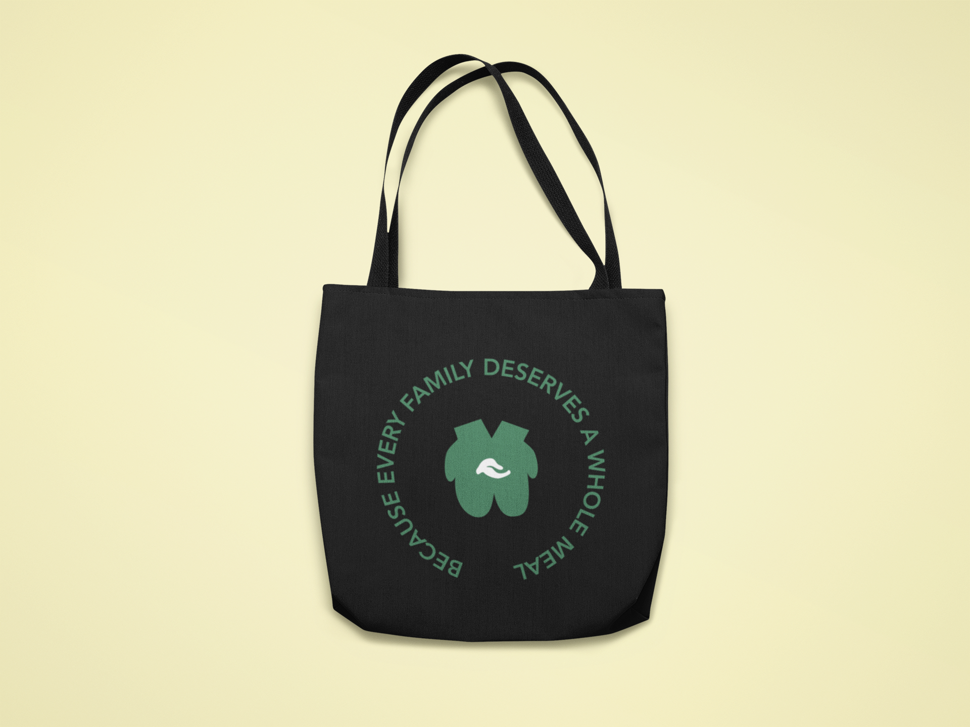
My first exploration of the world of rebranding produced this group of assets for my idea: Whole Foods Pantry. Many brands are linking themselves with well known social causes, so if Whole Foods were to be marketed towards those experiencing food insecurity, it would be a very different looking brand. I came up with a new logo, slogan, and advertising strategy in order for Whole Foods to change their image. Kept a similar font style so the logo is still recognizable, while using the leaf from the original logo to represent food, and pairing it with the mitten hands as a symbol of offering food to the community. This style was also applied to the app and bag designs, which stemmed from alternate logo design ideas.

